My Roles // Visual/UI Designer, Design System Creator & Manager, Illustrator, UX Contributor
United Income was a financial planning and wealth management solution founded in the summer of 2016 and acquired by Capital One in 2019. We combined technology, algorithms, models, methodology, and a team of wealth management experts to analyze the interrelationships of our customers' financial decisions in new ways. The financial planning and investment strategy solutions we produced with this approach improved our ability to build wealth for these folks over the course of their lives. Our tools were especially useful for folks approaching and transitioning into retirement.
Over the course of my four years at the company, the application evolved from a fairly simple interface to an absolutely insane one. Below are some examples of the design system we built to support the application as well as some key experience notes and improvements.
Here is a link to the archive of this design system stored by my friend and front-end developer counterpart James Ives. He also wrote an article about how we created the system.
The App in a Nutshell
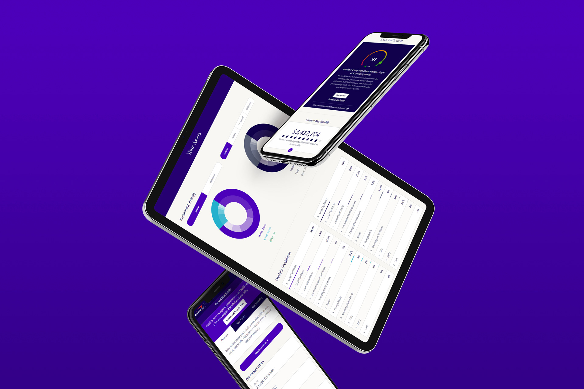
Here are a few images and short videos that show some of the functionality, interaction design, and motion design we included in the application.
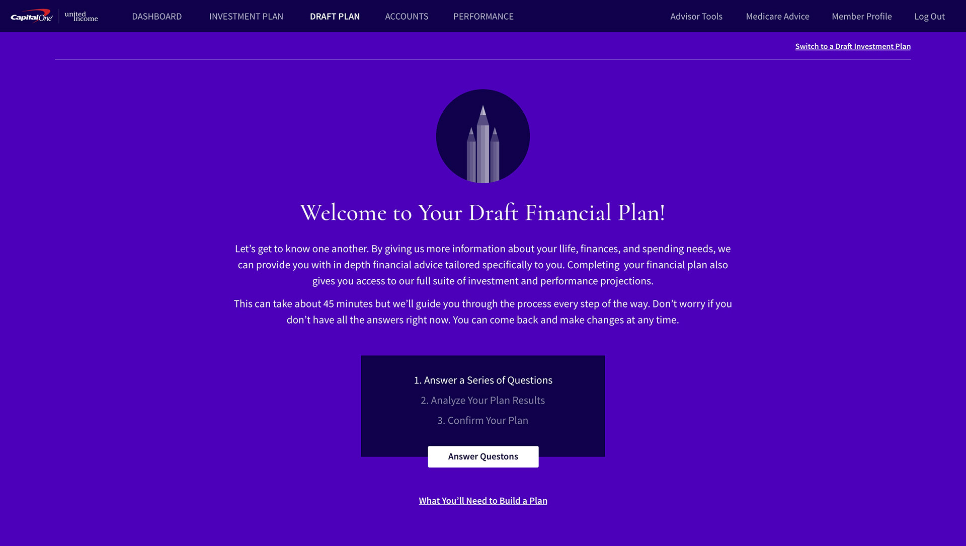
Intro screen to help explain the process.
Question Flow Interaction for building a Draft Financial Plan
We had pretty complex question flows. Here is what it would look like to make an edit to such a flow.
They let me have fun with animated gifs :)
Financial Plan Projections interaction

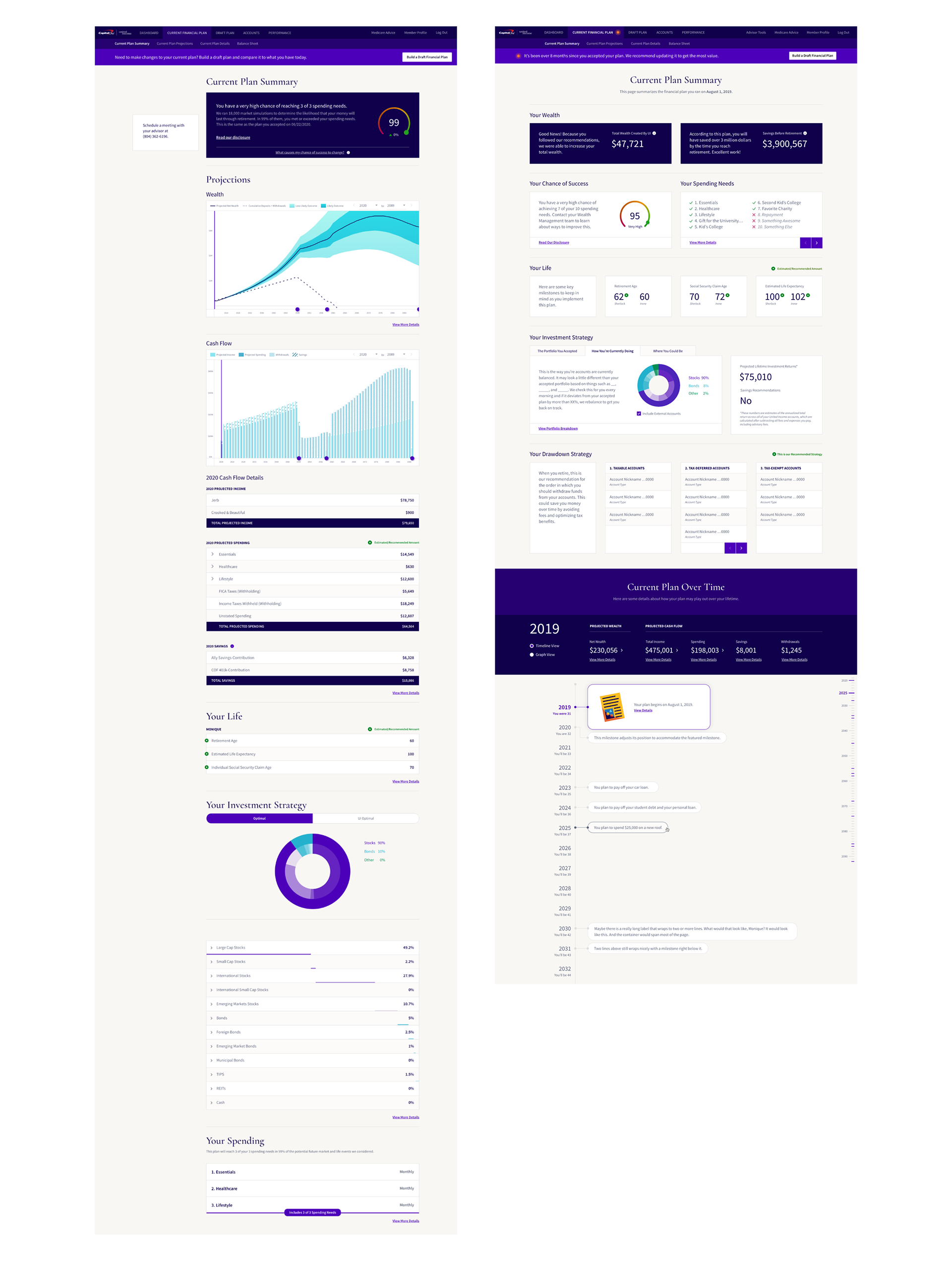
Examples of Current Plan interface vs Draft Plan interface
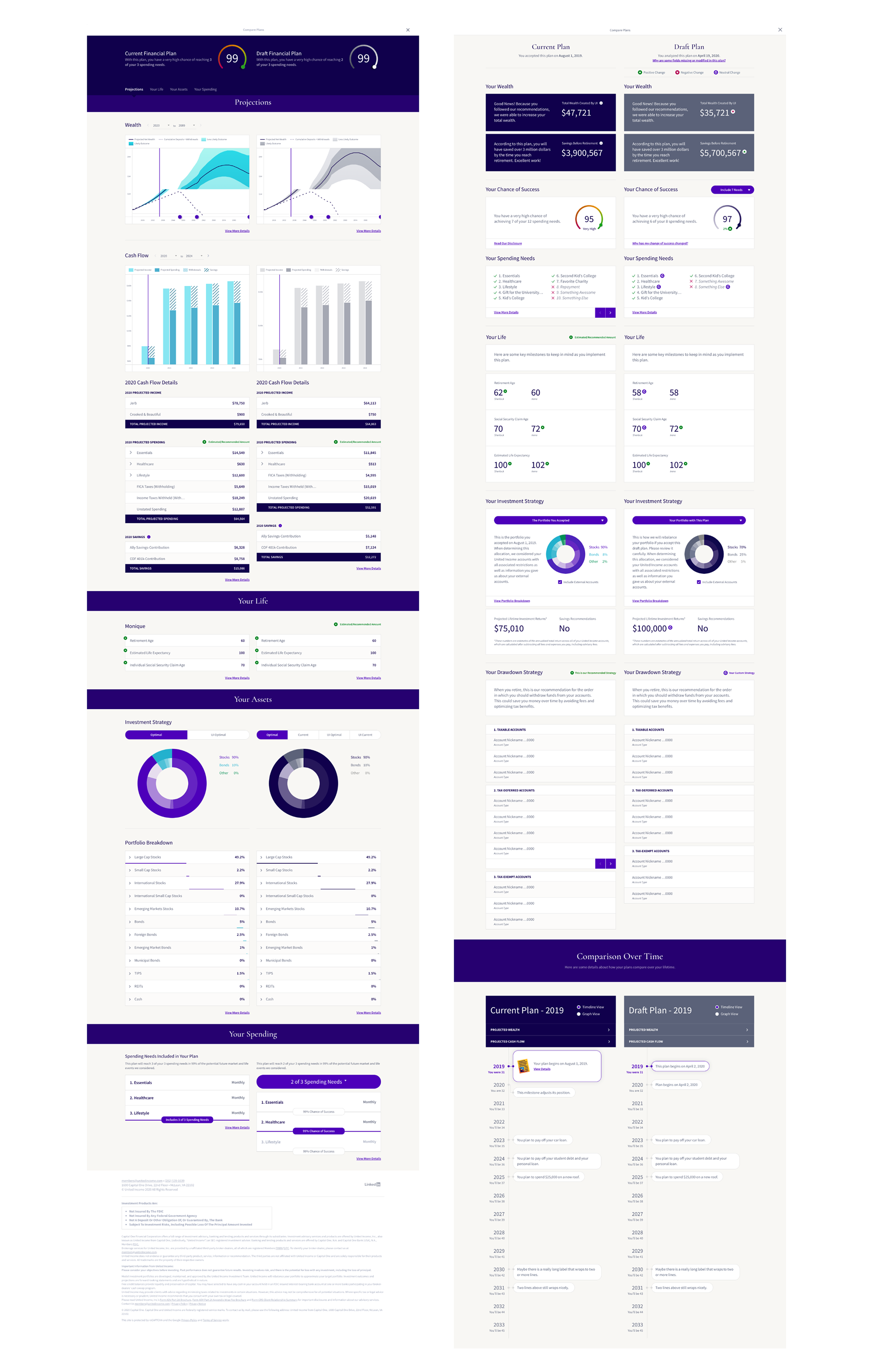
Compare Plans functionality
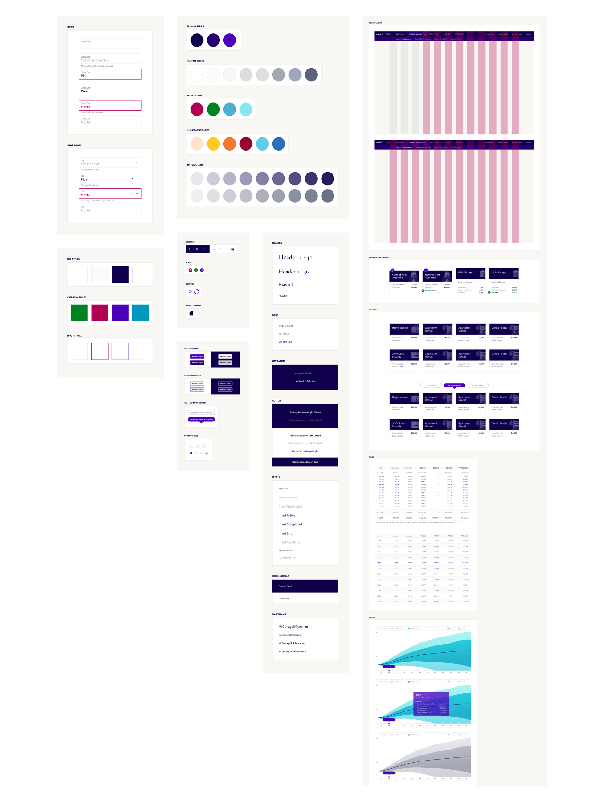
The Style Guide // Design System
Naturally, in order to ensure consistency within this complex app, we needed a design system. I built a style guide within our design software and worked with engineering to create a matching Storybook system for the development team.
A Cool Redesign
Toward the end of my time with the company, we redesigned the Financial Plan Summary feature. Over time, it had grown long and clunky. We conducted user surveys to see which information was most valuable to users and paired that knowledge with our own thoughts on the same. We wanted to give the people what they wanted but also help them learn about other, potentially better ways to evaluate their financial health. This design was created alongside a UX lead.
In my opinion, this feature is one of the strongest designs we put forth from a research, experience, and interface point of view.
This improved Compare Plans, too!
One of the biggest benefits of the improved plan summary was the ability to compare current and draft plans. This new design tightened up the interface and allowed us to showcase more commonly requested information in a cleaner, easier to digest interface. We even added useful indicators for which elements of the plan changed from version to version.